
Website project (00-5)
RICOM-Trust: a welcome page for an investment house
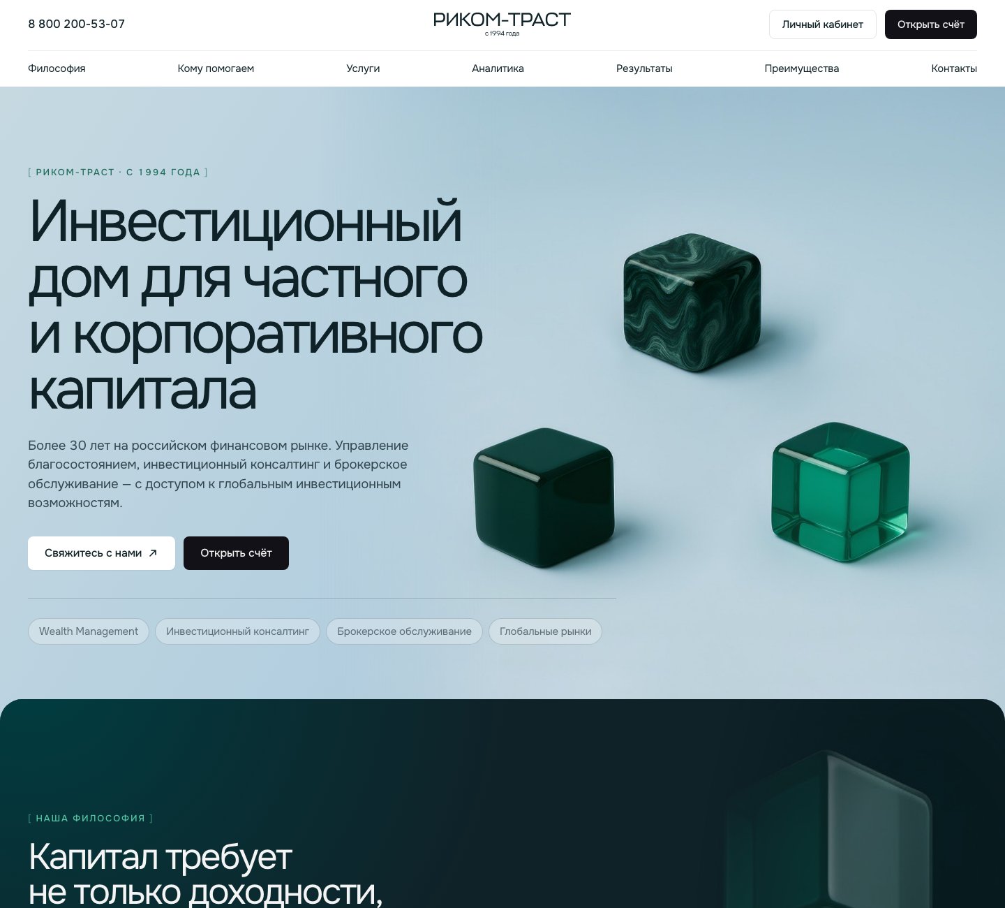
First screens: brand statement and investment philosophy
(01)
About the project
RICOM-Trust is an independent investment house on the Russian market since 1994: wealth management, brokerage, capital markets, and alternative investments for private and corporate capital – HNWI, family offices, and institutional clients.
The welcome page introduces the brand to a demanding audience and leads to two actions: opening an account or booking a personal consultation.
(02)
What we did
- /01 Built a premium visual identity: deep green palette, 3D glass objects, and generous air – the design itself signals the segment.
- /02 Led the structure with philosophy instead of products: “capital requires not only returns, but strategy”, followed by three investment principles.
- /03 Translated 30 years of track record into concrete proof: market-making leadership on MOEX, top-3 in bond placements, A+ rating.
- /04 Segmented the audience – private capital, family offices, institutional and corporate clients – each with its own scenario.
- /05 Two parallel calls to action throughout the page: open an account and request a personal consultation.
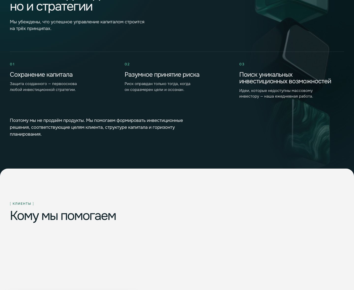
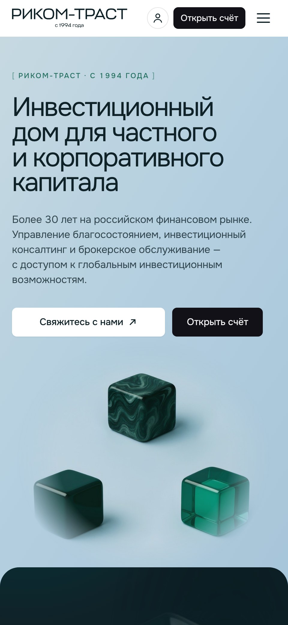
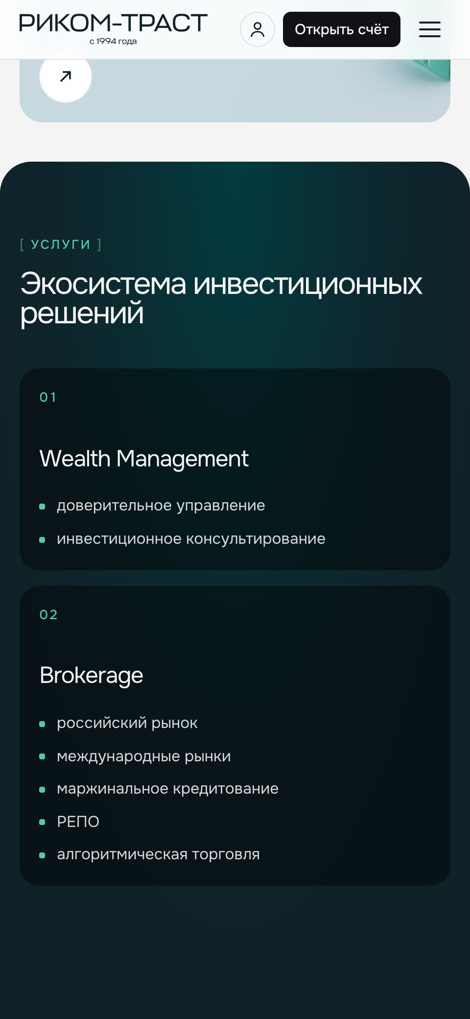
Philosophy and principles blocks, with the mobile version
Key solutions (03)
Premium identityDeep green, 3D glass, and air as a status signal
Philosophy firstStrategy before products for a demanding audience
Proof of track recordMOEX leadership, top-3 placements, A+ rating
Two parallel CTAsAccount opening and personal consultation
Premium clients don’t respond to pressure – they respond to clarity and restraint.